Our clients become our partners, and we’re proud to partner with some of the most innovative companies in business.
How do you go about rebuilding a web site for one of the country’s greatest microbreweries?
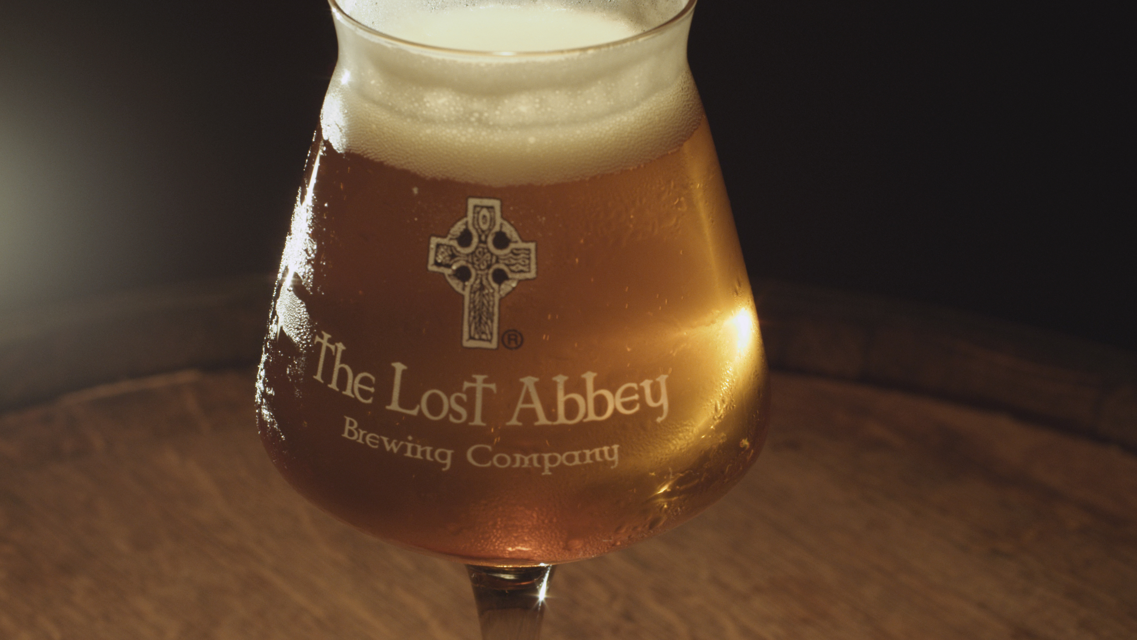
We started by thanking our lucky stars that Matt Varnish, art director and beer aficionado extraordinaire, not only brought the project to our doorstep but would be leading the design. It didn’t hurt that Matt had already gotten cozy with the Abbey’s new aesthetic by designing their 2013 Box Set.
With a solid visual direction already in place, we set out to look for areas of functional improvement. The client expressed certain needs – a mobile friendly version, a site that didn’t crash at critical moments and an updated design – all basic enough to accommodate in a typical overhaul. Being the perfectionists we are, we wanted to take the requirements a bit further. Starting with a deep-dive into existing functionality, we determined that a re-architecting of the site’s information and content management system was in order. Lost Abbey’s customers are devout beer geeks of the highest order, so satiating their curiosity for all the ephemera of the brewery – brewing techniques, ingredients and various measurements – was a primary objective.
The previous site functioned more as a blog and news page, giving the beers – the focal point of the business – much less attention than they deserved. Our first objective was to make the beers easy to find and enjoyable to explore and share. We were also presented a use case of the devout beer geek digging deep into the site, both on a desktop browser as well as a mobile device (with beer in hand!), so our focus became on cataloguing an immense amount of content in a way that’s intuitive to use, removing any possibility of navigational confusion within the site.
The client expressed certain needs – a mobile friendly version, a site that didn’t crash at critical moments and an updated design.
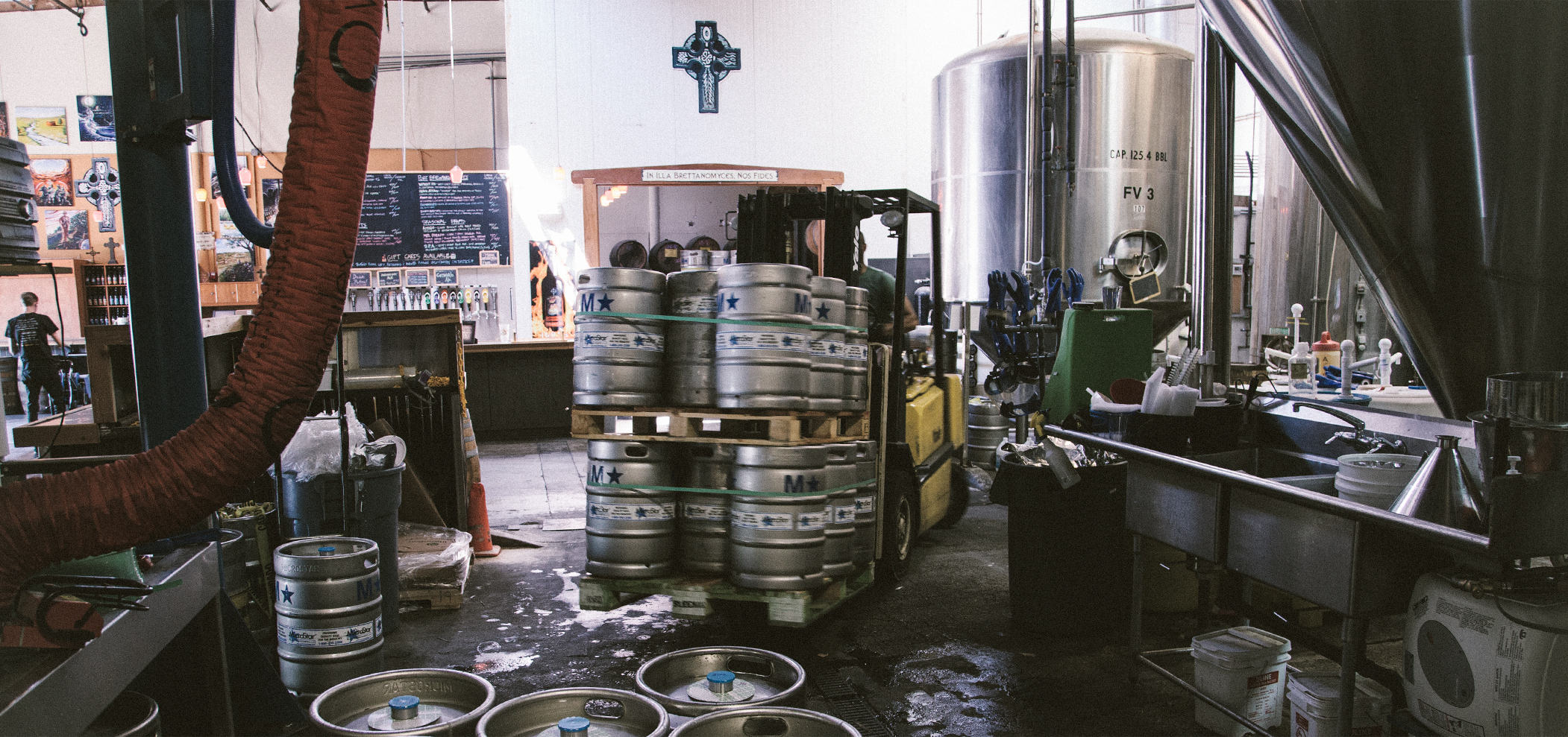
The next order of business was telling the Lost Abbey story. There was already a lot of great text content on the site, it just needed design to bring it to life. Some custom illustrations and an on-site photo shoot of brewery operations and the staff by John Schulz of StudioSchulz made this section shine far brighter than your standard ‘about us’ page. Abbey’s cultural embrace of a creative spirit and a knack for good prose helped immensely, too.
Our next priority was making the Tasting Room section more functional. Using some custom PHP scripting, we created a widget that tells you whether or not the tasting room is currently open, including a callout to tell you when last call is. This has proved to be one of the most popular features of the new site – particularly so on the mobile version of the site.
But what treasures await on the tap list and bottle menu upon a geek’s arrival at the taproom? The previous site had a ‘currently serving’ menu, but it was a simple spreadsheet pasted into the site. We felt something more elegant and intuitive was in order. We extended WordPress to allow relationships between the existing beer data (already showing in the ‘beer’ section) and the current tasting room menu. Now, all the staff needs to do is drag-and-drop items to build the current menu. Information such as beer style, sizes available and beer family is made uniform and consistent by pulling data from existing sections.
Our final challenge was more technical in nature, though critical in our delivery: how do we get pages – filled with layers upon layers of textures – to load quickly and not bring down the server on a routine basis?This task actually started at the beginning of our development, requiring us to architect a solution that was heavy on customization but light on third party plugins. The previous site used upwards of 30 WordPress plugins, many of which were outdated, some of which conflicted, and the collection of which contributed to chronic performance issues. By re-thinking the functionality and leveraging some of our trusted plugins, we were able to reduce that number to 6 plugins. This, coupled with an updated server put an end to intermittent crashes.Once server issues were sorted out, we focused on front end performance. We evaluated markup closely, reusing what we could and refactoring code as much as possible. By minifying and compressing all frontend code, plus serving all static assets from the Amazon S3 Cloud to reduce load on our primary server, we were able to get gigantic pieces of art and somewhat complex code to load well within the recommended 4 seconds.
The end product: one of the most challenging sites we’ve ever built with one of the most complex designs we’ve been tasked with bringing to life, but as such one of the most rewarding projects to date. See more of the project in our portfolio or just visit the site.
Our clients become our partners, and we’re proud to partner with some of the most innovative companies in business.